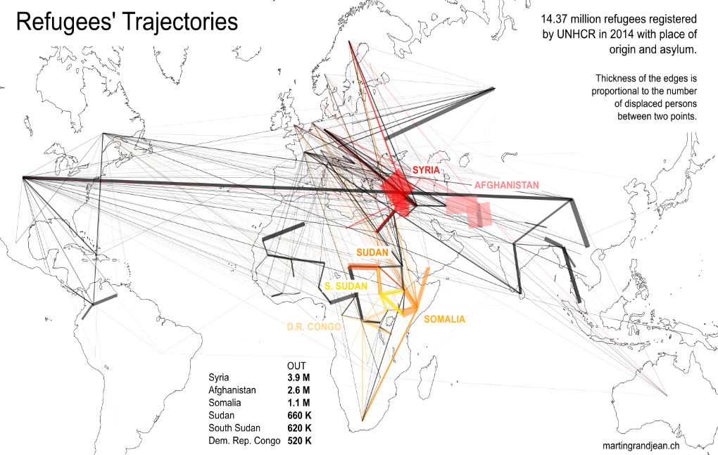
The graph above maps the 14 million refugees who fled out of their country during 2014.
This graph shows us the displacement of refugees in the world. By looking at the chart, we can tell that the largest displacement of refugees are from Syria, Afghanistan, Chad, Sudan, the Democratic Republic of Congo, and Somalia. The graph also tells us that many of those refugees are going to places like the United States, Canada, and countries in Western Europe.
However, there are some undeniable qualities issue. It’s a “blind” data visualization that suffers from two main issues:
1) The flows are not weighted: if there are 6,000 Mexican refugees in Canada, their edge appears to be the same thickness that a million Syrian refugees in Lebanon!
2) Giving more thickness to the edges at their arrival point, to show the direction of flow, is a nice graphical effect. But the consequence is clear: Europe and North America, with a high concentration of “endings”, are becoming very colorful while Africa and the Middle East are empty even though they host many more refugees (a smaller concentration of “endings”).
Although the map is not high quality and does not look pretty, it is very informational to data journalists.