The Dr. Martin Luther King, Jr. Library is a joint library for San Jose State University and the main branch of the San Jose Public Library. All SJSU students can obtain an SJPL membership card. You can apply online at the SJPL website and pick up the card at King's SJPL desk or at any of the SJPL branches. Once you have your card, you can borrow any of the SJPL items and use their online resources.
Many business classes will require that you create individual or group presentations to demonstrate your work. Here are some resources to help you make your presentations amazing!
This short article from Forbes will show you how to create engaging presentations.

 Let the Story Do the Work by
  Slide:ology by
  Better Presentations by
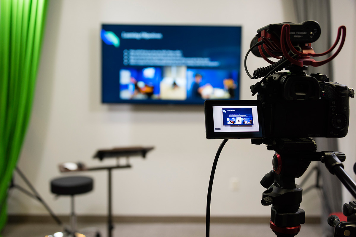
 The King Library's new Presentation Practice Room, in the Lower Level, offers a space for practicing, reviewing and recording presentations and pitches. Students can either plug in their own phone or tablet or they can use the camera and mic provided in the room. Students can display slides or play videos behind them on a the large Samsung 4K HD Smart TV or use a green screen that allows custom backdrops. The room includes a Samsung 4K Confidence monitor to preview the video, three-point lighting for the best visual results and an iMac with Camtasia to capture and edit the recording.
Adapted from:
Bankerd, Kathy. “How to Optimize Projection Technology: Using Fonts, Graphics, and Color to Maximize the Effectiveness of Your Presentation.” Syllabus. November/December 1997.
Bird, Linda. “Avoid the Mistakes of PowerPoint Rookies.” Smart Computing. January 2001.
Brown, David G. “PowerPoint-Induced Sleep.” Syllabus. January 2001.

